A practical guide to building or rebuilding your brand identity
From deciding between an evolution and a new identity, through strategy, the logo, type, color and grid system, to the guidelines and the launch plan: the stages and the decisions worth settling at each step.
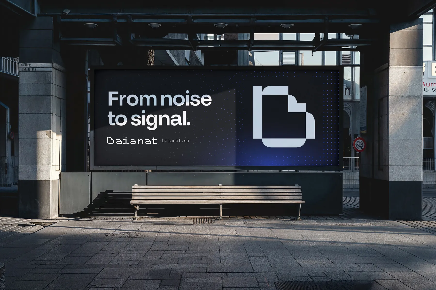
Many companies arrive at the identity decision after the symptoms pile up: a logo that appears in three versions in three places, colors that look different in print and on screen, and presentations that every employee designs their own way. At that point the request is usually "refresh the logo," when what is really needed is a complete system that works wherever the brand appears. This guide walks through the stages of building or rebuilding an identity, and the decisions worth settling at each stage before moving to the next.
A new identity, or an evolution of the current one?
The first question is not "what will the logo look like?" but "what has changed?" If the company's business, audience or market position has shifted, or it has merged with another organization, it most likely needs a new identity. If the brand is well known and has real standing with its audience but is applied inconsistently or looks dated, evolution is the wiser path: it keeps the recognition and trust the brand has earned, and fixes what is holding it back.
A simple exercise helps: gather everything the brand carries today in one place, from the headquarters sign to the email signature, and look at it all together. Whatever feels coherent is worth building on; whatever looks like a stranger to the rest is the first thing to reconsider.
Prepare before you commission
The quality of the output starts with the quality of the input. Before you approach any design team, you will save a lot of time by having clear answers to these points:
- A short description of the company: what it offers, to whom, and in which cities or markets.
- Your direct competitors, and what honestly sets you apart from them.
- Plans for the coming years: new products, new branches, or expansion beyond Saudi Arabia.
- The decision-makers on the project, and who has the final word.
- Where the identity will live: website, app, branches, vehicles, packaging, exhibitions.
- What must stay from the current identity, if there is one, and what is non-negotiable.
Naming the decision-maker early saves a great deal of time. An identity that passes through a large committee with no clear reference point usually ends up as a compromise that speaks for no one.
Discovery: listening before drawing
Discovery is where impressions become information. It involves interviews with leadership and teams, a review of how competitors present themselves and what they claim, and an inventory of every current brand touchpoint, one by one. The aim is to understand where the brand actually stands, not where we wish it stood.
What comes out of this stage?
A clear summary of what was heard and seen: strengths worth keeping, gaps between what the company says about itself and what its audience perceives, and spaces in the market that nobody clearly owns. Everything that follows is built on this summary, so it deserves to be reviewed and signed off before moving on.
Strategy before the logo
This is where the brand platform is written: why the brand exists, who it serves, what makes it different, and which traits people should feel in every interaction with it. Those traits are not decoration; they are the yardstick for every design decision that follows. When there is disagreement over a color or a shape, we go back to them and ask which option expresses them better.
Tone of voice also comes out of the strategy. A brand that wants to feel approachable and simple does not write like one that wants to feel institutional and composed, even if their colors are similar. In the Saudi market this includes an early decision: will the brand speak to its audience in simplified formal Arabic, in language closer to everyday speech, and where does each belong?
A logo is drawn once; the strategy is consulted in every decision after it.
The system: what an identity is made of
An identity is a set of rules more than a set of drawings, and every element in it has to be designed to work in its hardest conditions, not its most flattering ones.
The logo and its versions
A good logo reads small on an app icon, large on a building facade, and in a single color on a stamp or an engraving. One version is not enough: the system needs a primary logo, horizontal and stacked versions, a standalone mark for tight spaces, and a one-color version. If the name exists in two languages, decide early how they combine: side by side, one above the other, or each in its own version.
The Arabic typeface and its Latin partner
Type is one of the most consequential choices in a bilingual identity. Start with Arabic, since it is the brand's first face, then look for a Latin typeface that matches it in weight, character and rhythm, so that paragraphs in both languages sit side by side like members of one family. Before committing, check the practical things that are often forgotten: are there enough weights for headings and body text? Does it read clearly on phone screens? How do both sets of numerals look? And does the license cover print, website and app together?
Color
A palette is not a list of attractive colors but a set of roles: a primary color that carries the brand, supporting colors, and neutrals for text and backgrounds, with usage proportions that keep any one color from overwhelming the rest. Each color is specified for both print and screen, and text-on-background contrast is tested so the content stays readable for everyone.
Grid and spacing
The grid is what makes a social post, a report page and a roadside billboard look like one family. It sets where the logo, headings and margins go, and lets any designer who comes later work without starting from scratch. In a bilingual identity, the grid is designed to mirror cleanly between right-to-left Arabic and left-to-right English.
Supporting elements
Patterns, icons, photography style and illustration give the identity its personality when the logo is absent. A few, well-controlled elements are enough; an identity with many patterns and no rules has no pattern anyone recognizes.
Test on real applications
A logo should never be approved sitting alone on a white background. From the first drafts it belongs on the brand's most important applications: the branch sign, the app screen, a social post, the business card, the presentation. Many problems only appear there: a mark that disappears at small sizes, a color that dulls in print, or a long Arabic name that does not fit the space it was given.
Then prioritize the applications: what customers see every day is designed first, and what is used rarely can follow later, according to the guidelines.
Brand guidelines: what they should contain
The guidelines are what remain after the project ends, so they are written for the people who will use them: the marketing team, suppliers, printers and developers. Good guidelines answer their questions without them needing to ask anyone.
- The brand platform, its traits and its tone of voice, briefly.
- Logo versions, clear space, minimum size, and misuse examples.
- Colors with print and screen values, and their proportions.
- Typefaces, weights, and the heading and text hierarchy in Arabic and English.
- The grid, photography style, icons and patterns.
- Ready examples for everyday applications, plus source files that are organized and clearly named.
Launch and transition
A new identity does not launch at the push of a button. It needs a transition plan that sets what changes immediately and what changes gradually: digital accounts and the website can be updated quickly, while signage, vehicles and printed stock need a schedule that respects the budget. Most important, the internal team should know the identity before the public does: why it changed, what it means, and how to use it. Employees who understand the identity protect it; those who don't end up altering it without meaning to.
Common mistakes worth avoiding
- Starting with the logo before agreeing on what the brand should say.
- Judging designs by personal taste instead of the brand's traits.
- Designing the English version first and fitting Arabic in afterwards.
- Adopting a typeface without checking its license and weights.
- Handing over logo files with no guidelines explaining how to use them.
- Launching the identity to the public before the team knows it from the inside.
In short
A coherent identity is the result of decisions taken in order: understand the brand, define what it should say, design a system that says it everywhere, then document it and launch it with a plan. When those stages are respected, the logo becomes a step in the middle of the story rather than its beginning, and the identity becomes a tool that works for the company for years.