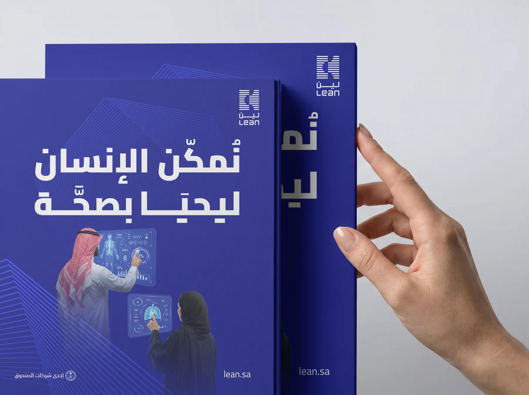
WhywedesigninArabicfirst
A design that starts in English and gets translated stays foreign to its reader. Here is how we do the opposite.
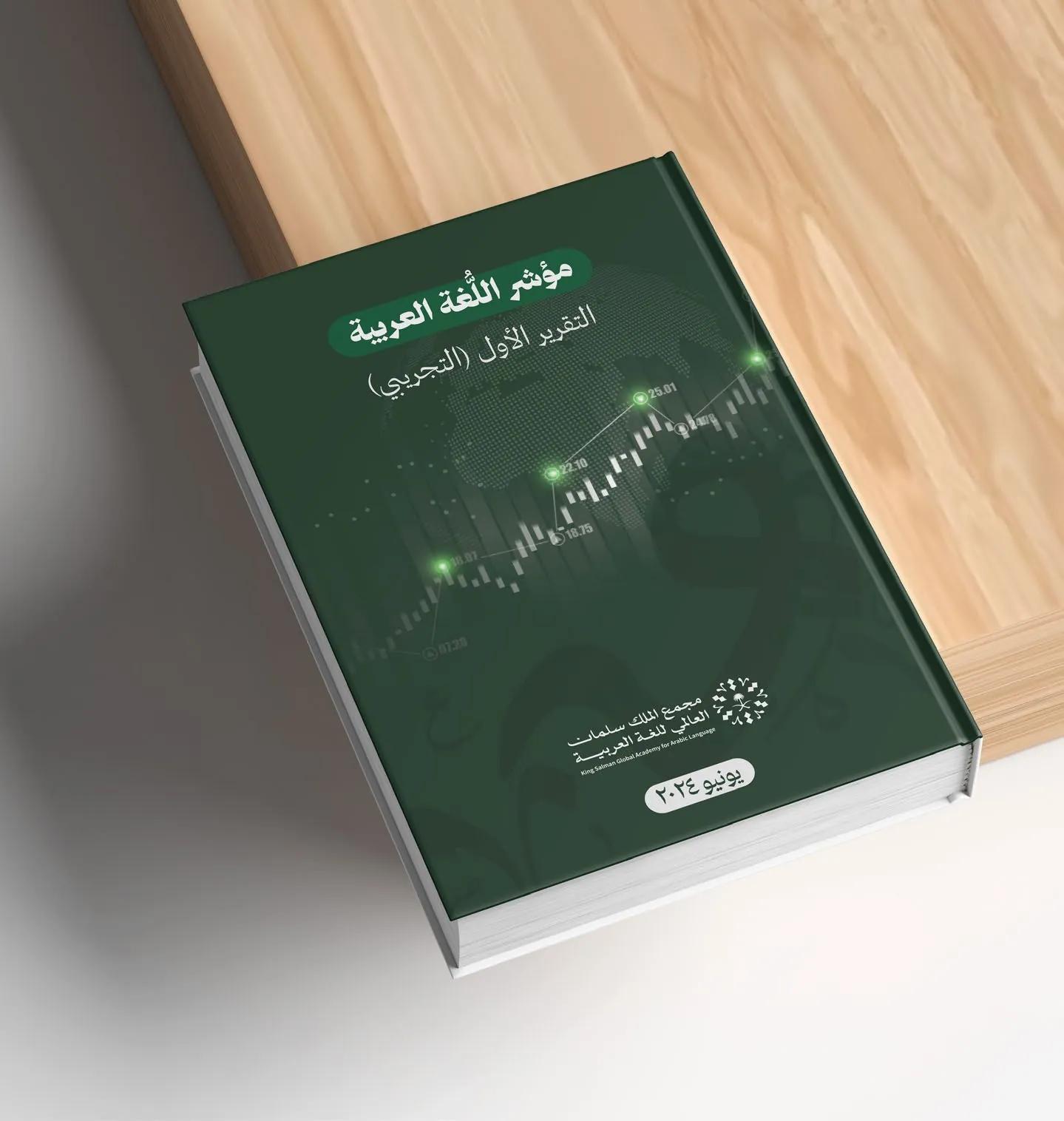
Many websites and publications in the region are designed in English first, then flipped into Arabic at the end of the project. The result is familiar: broken headlines, uneven spacing and Arabic type that doesn't match the rest of the design.
Arabic is not mirrored English
Arabic has its own rhythm: connected letters, varied heights and words that run long or short. A design that starts from it gives that rhythm room from the beginning.
Direction changes reading
The eye starts on the right, so headlines, numbers and arrows move. We draw the Arabic layout first, then build the English version from it with care.
Choosing the typeface
We look for an Arabic typeface that carries the brand's character and reads clearly on small screens, then pick a Latin companion that matches its weight and spirit — not the other way round.
When a design starts in its reader's language, the reader feels it was written for them.
The result
One design in two languages, each version feeling original. That is what we aim for in every identity, website and report we make.